Branding Design & Production
Design Thinking in Action
Transforming a Magazine from Print to Digital Project
Focus: Editorial Design · UX/UI · Digital Strategy · Design Thinking · Product Development
Deliverables: Print redesign · Responsive website · Mobile app
Approach: Empathize → Define → Ideate → Prototype → Test
The Challenge
An established magazine had a strong print presence but was struggling to meet the expectations of a changing audience. The print edition needed a clearer visual hierarchy and improved readability, while the website had an outdated, non-responsive experience. At the same time, digital-native readers increasingly expected convenient access to content through their phones. The challenge was not simply to redesign the magazine, but to create a connected experience across print, web, and mobile while maintaining a consistent brand identity.
My Role
I led the design-thinking process from research and problem definition through concept development, prototyping, testing, and refinement. My role combined creative direction, UX/UI design, editorial design, digital strategy, and project coordination. I translated audience research into design solutions, developed print layouts and digital concepts, explored the website and mobile experience, gathered feedback, and coordinated the process from initial ideas through production. This allowed me to connect creative thinking with practical product development.
Discovery
I started by understanding how different audiences interacted with the magazine. Through reader interviews, surveys, competitor research, and research into digital magazine trends, several patterns emerged. Print readers wanted a cleaner layout, stronger hierarchy, and better readability, while website users found the existing experience outdated and difficult to navigate. Digital-native readers expected a mobile-first experience and more convenient access to content on their phones. The research showed that the magazine did not have one isolated design problem; it had an experience problem across multiple platforms.
Strategy
I used the Design Thinking framework to turn research into an actionable product strategy. I first focused on understanding the audience, then defined the most important experience gaps before exploring multiple solutions. Prototypes allowed me to make the ideas tangible and gather feedback before moving forward. The resulting strategy was to create one unified magazine experience across three connected platforms: a redesigned print edition focused on readability and visual storytelling, a responsive website focused on navigation and content discovery, and a mobile app designed around convenient, personalized content consumption.
Development
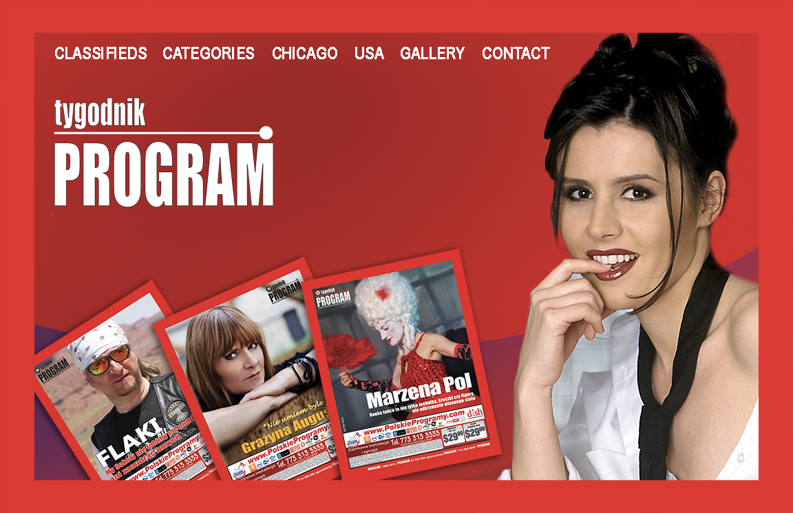
The development phase moved the project from research and ideas into tangible design concepts. For the print edition, I explored different article structures, grid systems, typography combinations, image treatments, and approaches to white space before developing the final direction. For the website, I created wireframes for a mobile-first responsive experience with simplified navigation, clearer content categories, search, tags, and article previews. For the mobile app, I mapped the core user experience around intuitive article browsing, saved content, offline reading, notifications, and personalization. Prototypes made it possible to evaluate ideas, identify friction points, and refine the experience before production.
Production
The project required more than creating individual designs; the three platforms needed to function as one cohesive brand experience. I coordinated the design and production process across editorial content, print layouts, photography and visual assets, website interfaces, and the mobile experience. I used prototypes, layouts, and visual specifications to communicate the intended experience and maintain consistency throughout the process. The goal was to make the transition between print, web, and mobile feel intentional rather than like three separate products.
Results
The project transformed the magazine from a primarily print publication into a multi-platform content experience. The redesigned print edition delivered stronger visual hierarchy, improved typography, readability, and more engaging use of photography. The website introduced a responsive interface, simplified navigation, and improved content discovery, while the companion app provided streamlined article browsing, saved and offline content, personalization, and notifications. Reader engagement increased with the new print experience, website traffic and session duration grew, and app downloads exceeded the initial goals. Most importantly, the project created a unified experience across print, web, and mobile.